Use new screen properties for responsive canvas apps


If you’ve started building responsive canvas apps by crafting size and position formulas on your controls, we’ve added some properties that may help you simplify your responsive formulas for some common situations. The addition of these properties won’t change the default behavior of your canvas apps; they’re optional things you can choose to use if you find them convenient.
Screen Orientation
The screen’s new Orientation property tells you the current orientation of the device or window in which your app is running: Layout.Vertical or Layout.Horizontal.
This is useful for customizing your app experience for each orientation if you desire. Suppose you have a control that you want to occupy the top half of the screen on a device in portrait orientation, or the left half of the screen in landscape orientation. You can set the control’s properties to these formulas:
X: 0
Y: 0
Width: Parent.Width * If(Parent.Orientation=Layout.Vertical, 1.0, 0.5)
Height: Parent.Height * If(Parent.Orientation=Layout.Vertical, 0.5, 1.0)
Screen Size
The screen’s new Size property tells you the approximate size of the device or window. Size is a positive integer; you can use the ScreenSize type in your formulas for readability: Small (1), Medium (2), Large (3), and ExtraLarge (4). With the default settings for app breakpoints (as this post describes later), these four sizes roughly correspond to a phone, a tablet held vertically, a tablet held horizontally, and a monitor for a desktop computer.
You can make decisions about your app’s layout based on the value of the Size property. For example, you can set a control’s Visible property to this formula if you want to hide the control on a phone-sized device, but show it on other devices:
Parent.Size >= ScreenSize.Medium
Set a control’s Width property to this formula if you want the control to occupy a different fraction of the screen width on screens of different sizes:
Parent.Width *
    Switch(Parent.Size,
        ScreenSize.Small, 0.5,
        ScreenSize.Medium, 0.3,
        0.25)
Custom Breakpoints
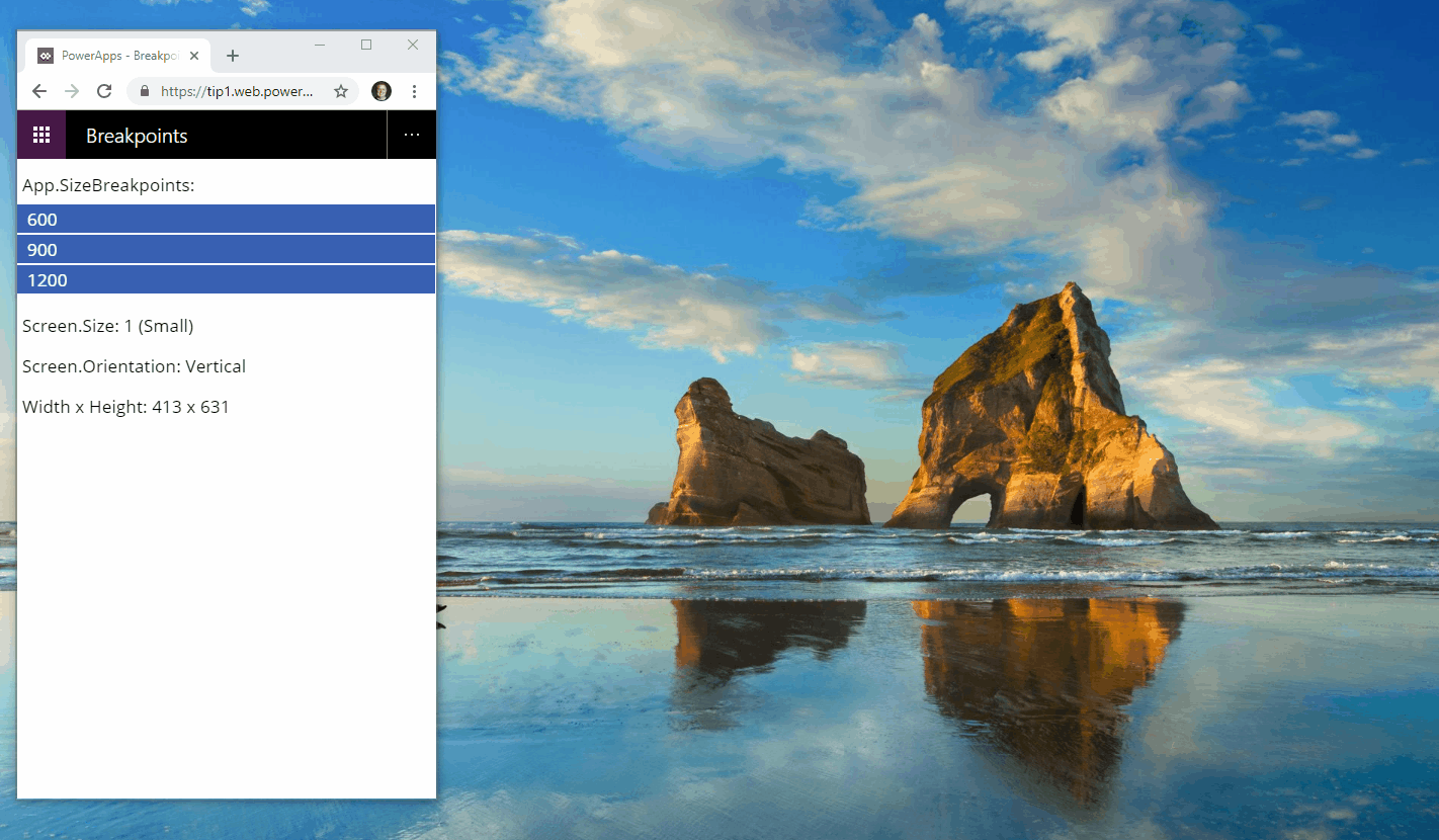
The screen’s Size property is calculated by comparing the screen’s Width property to the values in the app’s SizeBreakpoints property. This property is a single-column table of numbers that indicate the width breakpoints that separate the possible values of the screen’s Size property.
In a canvas app created for a tablet or the web, the default values in the app’s SizeBreakpoints property are [600, 900, 1200]. Because a canvas app created for a phone uses coordinates that are effectively double the coordinates used in other apps, the default values in the SizeBreakpoints property for that type of app are [1200, 1800, 2400].

If needed, you can customize the breakpoints for your app by changing the values in its SizeBreakpoints property. Select App in the tree view, select SizeBreakpoints in the property list, and then edit the values in the formula bar.

You can create more than three breakpoints, but only sizes 1 through 4 have corresponding named ScreenSize values. In your formulas, you can refer to sizes beyond ExtraLarge by their numbers (5, 6, and so on). You can also set fewer than three breakpoints. For example, if you need only three sizes (two breakpoints), the possible screen sizes will be Small, Medium, and Large.
Feedback
We’ll continue to improve the experience of making responsive canvas apps and update the documentation about how to create responsive layouts.
Give us your feedback on these new features, and what else you’d like to see. Use the comments below, or post in the community with the hashtag #ResponsiveLayout.
