Always show important information on the form header in the Unified Interface


With the October 2019 preview release of the Unified Interface for model-driven apps in PowerApps we are introducing several new improvements to the form headers. With this release, admins and makers will be able to choose a style of a form header that fits the needs of your customers. The new headers allow an admin or maker to choose up to three options to render data:
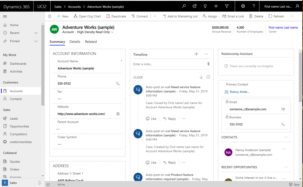
- High-density with read only fields
- High-density with a flyout to support different types of components including editable, custom controls or web resources (default experience)
- Low-density header
New High-Density Headers
When users interact with important information in the header section of a form it’s important to always show information when navigating on a page. With the new high density headers your users will always see up to four fields, and the title of the record no longer truncates no matter a user’s screen size, from extra-wide sizes down to narrow mobile-size screens.
With the new headers:
- Four read-only fields will always be on the header, they no longer move behind a chevron.
- The title will never truncate, users will always know what record they are working on.
- The read-only indictor for a record is now at the top of the form and will include additional information to help users better understand why the record is in a read-only state.
- The form selection option is moved to below the title of the form, reducing confusion caused between the record title and the form name.
- Icons will not be visible without additional settings enabled for the entity.
An admin or developer can set the type of experience they want for their users by using the new Forms Designer or by manually updating the form definition in their solutions.
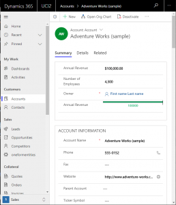
High-Density Header with read only fields
The high-density header will show up to four read-only name value pairs of record fields . Information in the header will never reflow into a flyout or onto the main body of the page as you move from wide to small viewports or on mobile devices. The information will always be available even when switching tabs on the form. The title will never truncate but will wrap as needed to ensure all information is available regardless of the size of your screen. The form selector will be available below the record title.
High-Density Header with read only fields – Wide Screen Size
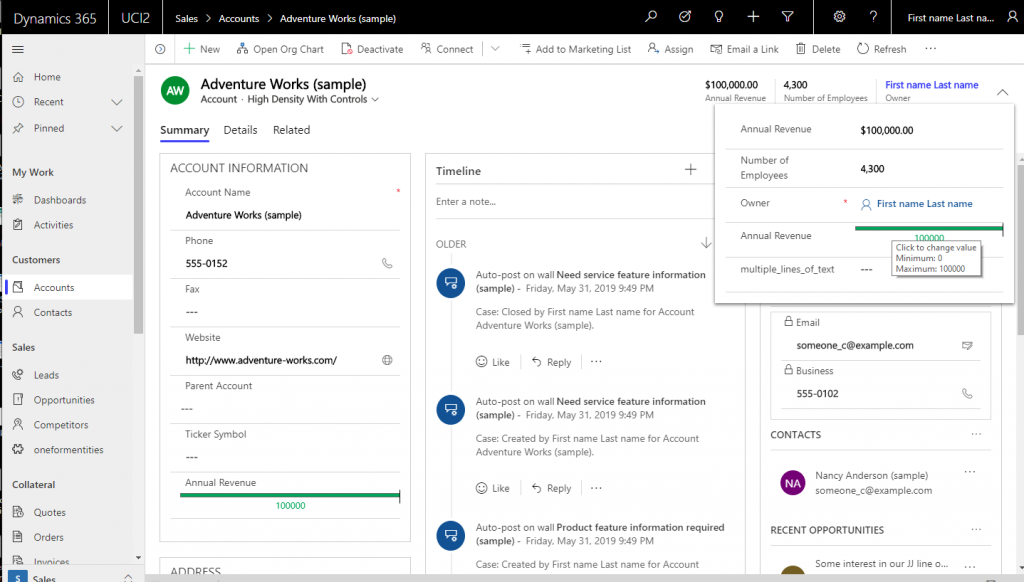
High-Density Header with chevron flyout and controls (default mode)
If you need controls that are editable, custom, or web resources you can use the high-density header with a chevron and flyout that contains all the controls in the header. , custom or a web resource. This will be the default experience with the 2019 August preview, October GA release.
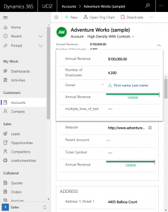
High-Density Header with flyout – Wide Screen Size
High-Density Header with Flyout – Small Screen Size
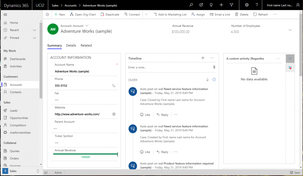
Low-Density Header
Low-Density header will retain the experience of the form header prior to the 2019 August preview, October GA release wave. This mode automatically reflows information into a chevron and does not guarantee that four fields will be visible in the header This mode also automatically reflows header information into the first tab of the body of the form, so the data is not available across tabs in a small viewport or mobile experience.
Low-Density Header – Wide Screen Size
Low-Density Header – Small Screen Size
With these changes your users will be able to quickly view important information about records in your application and you will have multiple options with your form headers and we look forward to hearing your feedback.
You can comment on this post or on the PowerApps Community.
