Note: This blog is in continuation of the announcement of modern controls coming to canvas apps & new look for model driven apps. You can find the June 2023 updates here.
Modern controls updates in canvas apps
In the month of July, there is critical progress made with exciting updates on theming, releasing new controls and improvements on existing controls.
Below are the July updates for modern controls already released or currently in deployment:
New theming system:
We’ve introduced a new modern theming experience for makers. It allows you to change the look and feel of apps built with modern controls with greater ease and flexibility. In this initial release, makers can choose one of the 6 out-of-the-box themes from the new Themes pane:

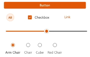
When a theme is selected, it will automatically be applied to all modern controls, providing a fresh and cohesive look to your app through a single action:
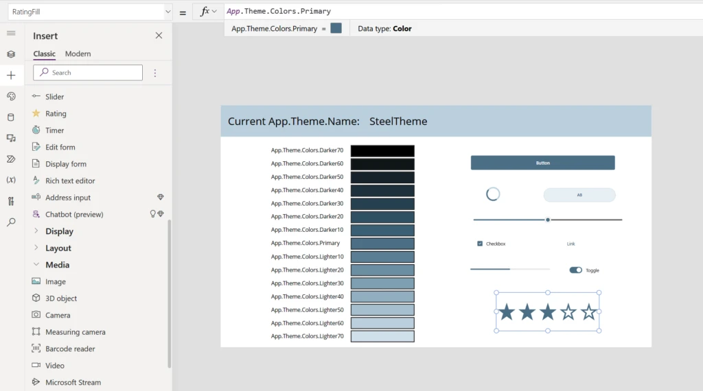
Classic controls can also take advantage of modern themes by accessing theme variables via Power Fx. In the example below, the classic rating control has been added to the app and made to align with the theme by mapping its color to the Primary color from the theme:
To try out this theming experience, enable the “Modern controls and theming” preview setting. Please provide us feedback from the thumbs up/down option in theme pane. You can also view full documentation here.
New control released:
- Combo Box – One of the topmost ask on dropdown has been the functionality of Combo box. We have recently released this new control which allows makers to setup option set with multi select and primitive search based on string as capabilities.

- Toggle – This is also a recent addition to list of modern controls. This also has OnCheck, OnUncheck and OnSelect properties to use this control effectively.

Key control improvements:
Below are the important updates we made to the controls last month:
| Radio | Radio control is now available in three different layouts: Vertical layout  Horizontal layout  Horizontal Stacked layout  |
| Dropdown | The items limit to display in dropdown has been increased from 25 items to 500 items. We also fixed issues with player mode in studio for this control. |
| Button control | Button control has more visual variants available:  |
| Text Input | There are additional properties added on text input control for our makers to effectively use this control: 1)Placeholder – This is property for hint text which displays on control. 2) Format – The control now supports three formats – Text, Password and Search. |
What is next?
There are several awesome capabilities that we are going to be bringing over the coming weeks:
- Per control styling – We recognize that specific components in an app may need to be styled independent of the theme to achieve the desired app visuals. Towards this need, we are working on exposing more customization to modern controls that allow you to deviate from the theme styling. The initial focus of per control styling will be on color and font size.
- Updates to theming system – We will be continuing to expand the capabilities of this new theming system. We are working to bring in custom themes, which will allow makers to create their own themes that infuse their unique brand identity and design preferences into the app and reduce the need for styling customization at the control level.
- Upcoming controls
- Header control: Starting this fall, makers can look forward to using out-of-the-box higher level building blocks to create their apps. These controls will be able to handle more complex app scenarios while being easy to configure and responsive. The first of these controls will be App Header, which is expected in the fall. Improved app navigation is another concept we will address with these controls, and App Header will also be enhanced to handle navigation.
- Date Picker: There are some exciting updates coming on date picker control. Following are some improvements in progress:
- The control will have visual improvements and are now more aligned to the design language of rest of controls.
- We are introducing date format property which will help makers across the world define in local formats – like dd/mm/yyyy.
- Form Control: We have a new form control based on modern controls in development which aligns better with the new design language and similar in functionality of existing form controls with no new learning curve for our makers.
- Grid + List control: We have an exciting responsive control in works which makers will be able to add soon to display data as a grid or list, and they can configure the state of control depending on the width of the screen size.