Note: This blog is in continuation of the series of modern controls coming to canvas apps. You can find the September 2023 updates here. Recently, we also announced GA for modern, refreshed look in model apps.
In October’23, we continued enhancing modern controls and theming and delivered some key enhancements as mentioned in this blog, which is rolling out to our customers at the time of publish. Our ongoing investments spans across improving existing controls, improving theming, and adding new controls to be used by makers.
A step ahead – general availability of some modern controls in canvas apps
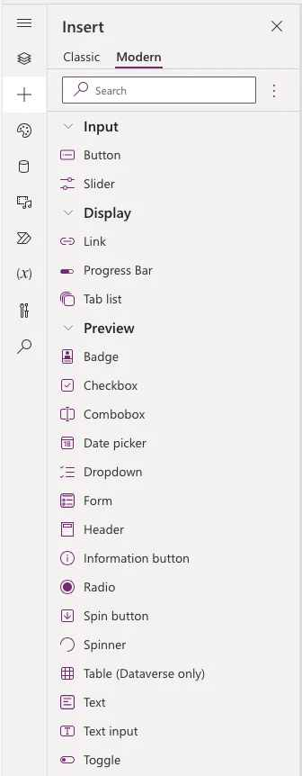
Many of Power Apps customers have already started adopting these controls at scale. To support them in their journey, we have now started transitioning controls from preview to general availability starting Nov 13th. The first set of controls are – Button, Link, Slider, Tab list and Progress Bar. This list is based on high satisfaction reported by makers and critical feedback addressed on these controls. In coming weeks, we will continue to add more customization capabilities like font color, background color, padding and more – on all controls. With this update, we will also be now providing full supportability to generally available modern controls to our customers.
We will continue this momentum and soon transition more controls (including the input controls) to general availability by early January. The remaining controls will be moved to the GA stage individually on a week-by-week basis.
Despite moving some controls to GA, modern controls and theming will continue to be an opt-in feature until the end of this year. We will, however, be moving the opt-in setting from upcoming features panel to general tab in settings by end of 2023 and will be turning modern controls on by default progressively for new apps in the next year, as we continue addressing reported gaps and adding new capabilities to these controls for our makers.
Enhancements to modern controls & theming
Below are the updates made to controls in the last month:
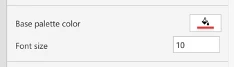
- Font size and color property: In an effort to extend customization capabilities on controls, we added the capability to update the base palette color and font size on controls. It provides our makers capability to customize the color and font size of text within a control. These properties provide makers the ability to customize the font size of text within a control and the color palette used to style the control. This update will be followed by adding more font-related and visual customizations in coming month(s).
- Improvements to controls for general availability: We enhanced Button, Link, Slider, Tab list and Progress bar as following:
- We updated the controls to provide right output properties.
- All accessibility issues have been fixed and controls are ready for prime time.
- Overflow menu and padding to tab and button are now optimized to have the best experience for our end users.
- We are setting better defaults and sample data for all controls.
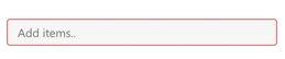
- Introducing field validations: Field validations represent a significant improvement for managing error conditions in input controls in Power Apps. This is done through a new property we introduced called – ValidationState – that is applicable for all input controls. This property has two states – None, Error, with controls in an error validation state showing red borders.
Makers can leverage this property using PowerFx to write advanced scenarios for error handling and can also describe patch rules based on the value in this property. The new form control also now uses this property for error handling by default!
- Table control: The Table control now supports more connectors, including Excel, SQL, and SharePoint connectors. With this update, we have removed the limitation of only supporting the Dataverse connector. We have also fixed the issue where ids were showing choice type columns for Dataverse tables.
- Form control: We have updated the current form control in preview to now support combo box for choice type and multi-select scenarios out of the box. We also fixed the title issues in the horizontal layout of the form by introducing right truncation patterns.
- Theme pane accessibility: As we continue attracting new Power Apps makers in huge numbers, we have addressed the remaining accessibility issues for the Themes pane.
Upcoming enhancements to modern controls and theming:
We are currently working on few exciting updates and will be released in few weeks:
- Font properties on all applicable controls: You will soon be able to customize font, font color, font weight and font style on all modern controls.
- More customization options on text control: We are in process of updating text control to also support background color and padding for our makers to use these controls effectively.
- Table control: We are introducing additional customization properties on table control:
- Show Avatar: You will soon be able to show and hide avatars in your list view of the table control.
- Show Footer: You will soon be able to show and hide footers in your table visual.
- Show column headers: You will soon be able to show and hide column headers in your table visuals based on the scenario makers want table to achieve.
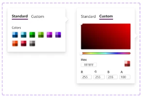
- New color picker for base palette color: Since the BasePaletteColor property generates a new color ramp that is applied to a modern control (and not a single-color selection), we are updating the color picker to better communicate the selection of a set of colors rather than an individual color.
- Modern controls and theming will be default on in preview: Before end of this year, all new apps built in make.preview.powerapps.com (and in preview environment), will have modern controls enabled by default as a control set. The opt-in setting will still be part of general tab and can be switched off, if required.
- Fluent icons: Makers will be able to add standalone icons. Makers will also be able to add an icon on the button.
We sincerely thank our community and makers for continuing to provide us feedback and help us build these capabilities. We will continue to ship updates to improve our controls and theming in response to the feedback we receive from you all.