10 Reusable Components: tab control, calendar, dialog box, map control and more


This blog post will present a set of custom controls built using the new PowerApps component feature for Canvas apps.
As a prerequisite, check out Yifie Wang’s blog post introducing the PowerApps components feature and Brian Dang’s “start your journey with components” blog post that includes instructions on importing/exporting components and more.
Before we delve into individual components, I would like to share 2 guiding principles we used as much as possible when building these controls.
1) A reusable control should offer a degree of customization and flexibility so that consumers of the controls do not need to delve into the component’s internal implementation in order to meet their requirements.
2) The interface of the control should remain simple and clean. By interface here, I mean the input and output parameters of the components. One has to carefully consider which input parameters are worth exposing. There is a balance between providing a flexible controls and over bloating the control with too many parameters (Interface bloat).
To follow these 2 principles, we used a simple strategy where exposed only important input parameters and used a generic Styles property (a value-pair collection) to include more refined style related parameters that are useful for those who wants to further change the look and feel of the control.
You can download the demo app package here and the individual components here.
Special Thanks to Denise Moran for her contribution to this v1 iteration. You too can be a contributor. Head over to the PowerApps tools github and join the community in adding your own components.
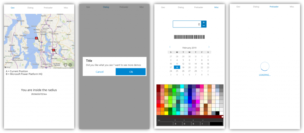
Here is an overview of the components:
Map Control
Static Bing Map component. Allow you to render static map based on Latitude and Longitude. User can specify zoom levels, push-pins…etc
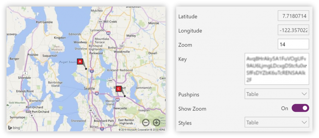
| Property | Description |
|---|---|
| Latitude | Sets the latitude of the location. |
| Longitude | Sets the longitude of the location. |
| Zoom | Zoom level of the map component. |
| Key | Required Bing Map Key to use the component. |
| Pushpins | Sets a collection of pins that is rendered within the map. Table({Latitude:Location.Latitude,Longitude:Location.Longitude,PinStyle:1,Label:"A"},
{Latitude:47.582119,Longitude:-122.141265,PinStyle:4,Label:"C"}) |
| Show Zoom | Sets the visibility of the zooming buttons. |
| Styles | Sets a collection of styles that controls various visual aspects of the map. Table({Key: "Imagery", Value:"Road"}, {Key: "PinStyle", Value:"50"}) |
Radial Gauge Control
The Gauge Control displays a value in a certain range using a needle on a circular face.
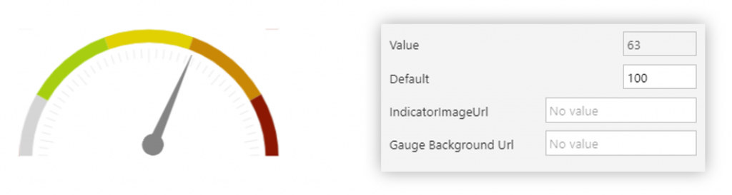
| Property | Description |
|---|---|
| Default | Sets the default % value of the Gauge. Range from 0-100. |
| Indicator Image Url | Sets the image representing the needle of the gauge. |
| Gauge Background Url | Sets the image representing the semi-circle |
Geo-Fence Control
A non visual component that signals when the mobile device enters or leaves a particular area within a certain radius. This component will only be visible in the PowerApps Studio and will not render when the app is running. Given Latitude, Longitude and a radius, this control will compute given the current geo-location of the device whether we are withing the specified radius.
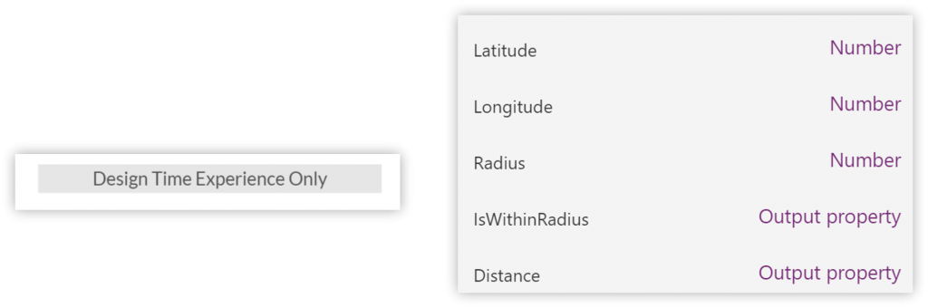
| Property | Description |
|---|---|
| Latitude | Sets the latitude of the target location. |
| Longitude | Sets the longitude of the target location. |
| Radius | Radius in Kilometer |
Output
| Property | Description |
|---|---|
| IsWithinRadius | Gets a boolean value signaling whether the distance between current location and specified location (Latitude and Longitude) is within the radius. |
| Distance | Gets the distance in Kilometer between current location and specified location |
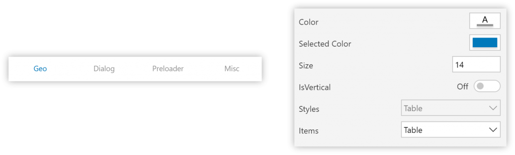
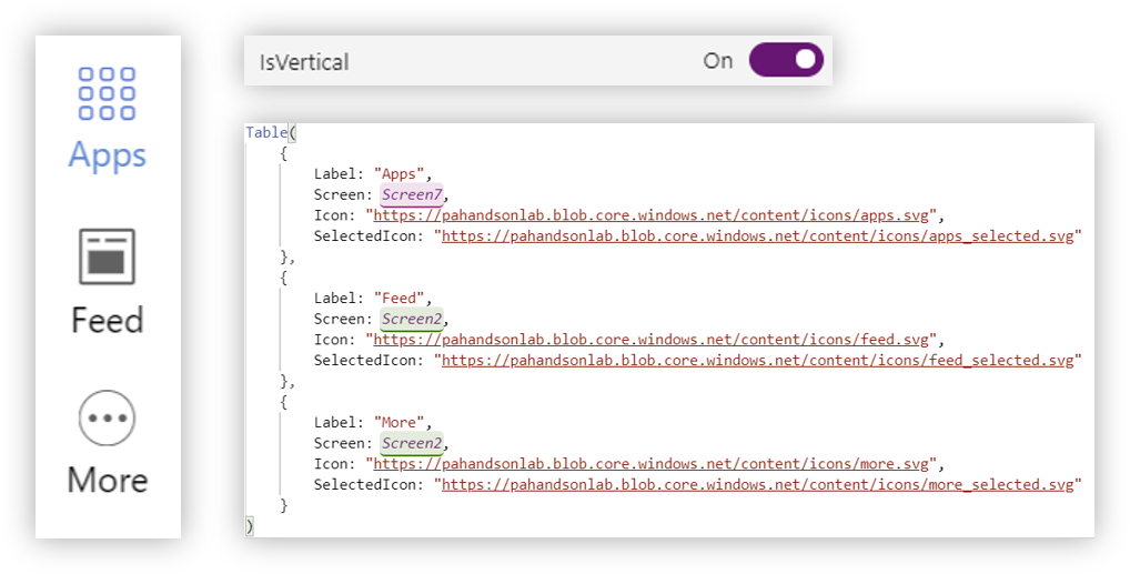
Tab Control
A tab control is a flexible navigation component that can be used to build tabbed interfaces in PowerApps applications. Tabs can be configured to navigate to other screens or to trigger any action such as launching a different app or opening the browser. A tab control can be used for vertical and horizontal menus.
| Property | Description |
|---|---|
| Color | Sets the text color. |
| Selected Color | Sets the text color when the tab is selected. |
| Size | Sets the font size of the text. |
| IsVertical | Sets the orientation of the tab control. |
| Items | Table({ Label: "Tab 1", Screen: Screen1, Icon: "", SelectedIcon:"" },
{ Label: "Tab 2", Screen: Screen2, Icon: "", SelectedIcon:"" },
{ Label: "Tab 3", Screen: Screen3, Icon: "", SelectedIcon:"" }
) |
| Styles | Sets a collection of styles that controls various visual aspects of the tab control. e.g:
Table({Key: "TabControlImageWidth", Value:"30"},
{Key: "Font", Value:"Segoe UI"}) |
Output
| Property | Description |
|---|---|
| Selected | Sets the selected tab item. |
Customization:
With a little bit of customization, we can achieve a different look and feel for the tab control:
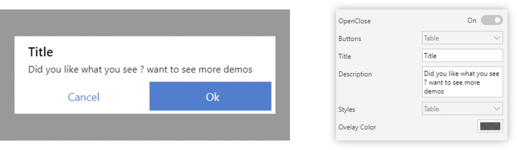
Dialog Control
Dialog controls are modal UI overlays that provide contextual app information. They block interactions with the app window until being explicitly dismissed. They often request some kind of action from the user.
| Property | Description |
|---|---|
| OpenClose | |
| Buttons | Table({Label: "Cancel", Fill:"#FFFFFF", Color:"#0086D0"},
{Label: "Ok", Fill:"#0086D0", Color:"#FFFFFF"}) |
| Title | Sets Title of the Dialog Box. |
| Description | Sets the body text of the dialog box. |
| Styles | e.g:
Table({Key: "Font", Value:"Segoe UI"},
{Key: "DialogTitleFontSize", Value:16},
{Key: "DialogDescriptionFontSize", Value:12})
|
| OverlayColor | Sets a collection of styles that controls various visual aspects of the tab control |
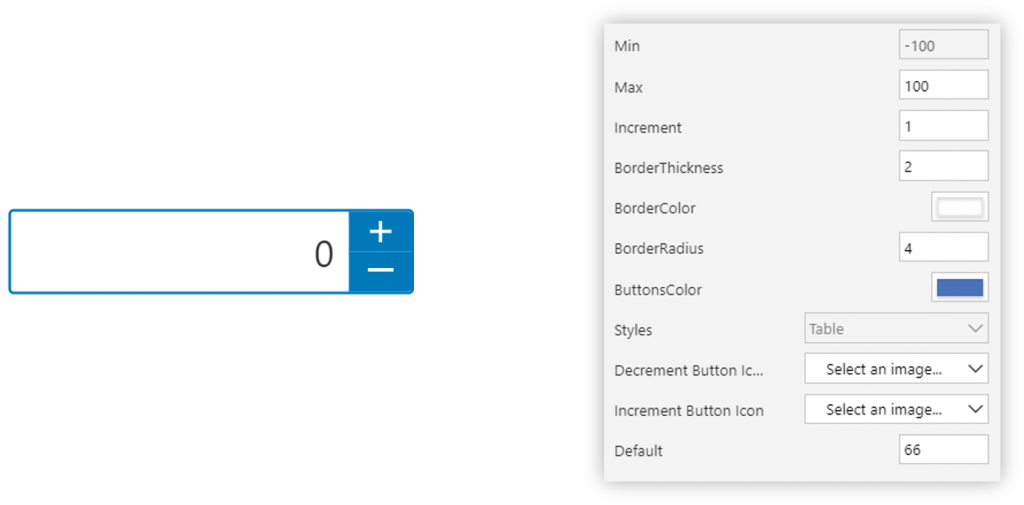
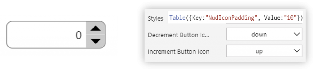
NumericUpDown Control
The NumericUpDown control allows users to increase or decrease a numeric value using the increment and decrement buttons.
| Property | Description |
|---|---|
| Min | Sets the minimum value to which the user can set for the NumericUpDown. |
| Max | Sets the maximum value to which the user can set for the NumericUpDown. |
| Increment | Sets the increment used when user increments or decrements the NumericUpDown. |
| BorderThickness | Sets the border thickness of the NumericUpDown. |
| BorderColor | Sets the border color of the NumericUpDown. |
| BorderRadius | Sets the border radius of the NumericUpDown. |
| ButtonsColor | Sets the color of the increment and decrement buttons. |
| Styles | Sets a collection of styles that controls various visual aspects of the NumericUpDown. e.g:
Table({Key: "Font", Value:"Segoe UI"},
{Key: "NudIconPadding", Value:10}) |
| Increment Button Icon | Sets the image for the increment button. |
| Decrement Button Icon | Sets the image for the decrement button. |
| Default | Sets the default value of the NumericUpDown |
Output
| Property | Description |
|---|---|
| Value | Gets Current Value of the NumericUpDown. |
Customization:
Bar-code Generator
Barcode generator for code39
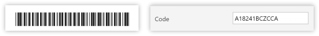
| Property | Description |
|---|---|
| Code | Sets the text used the generate the code bar using code 39. |
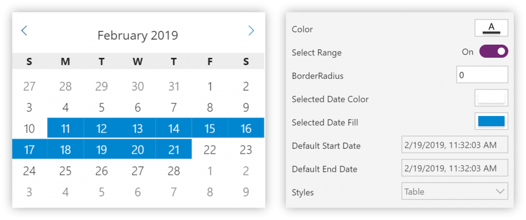
Calendar Control
A calendar view lets a user view and interact with a calendar that they can navigate by month or year. A user can select a single date or a range of dates.
| Property | Description |
|---|---|
| Color | Sets color of the text. |
| Select Range | Set the mode of operation of the calendar. When set to true, user can select a range of dates. When false, user can only select a unique date |
| BorderRadius | Sets the border radiaus of the selected date rectangle. |
| Selected Date Color | Sets the color of the text of the selected date. |
| Selected Date Fill | Sets the background color of the selected date rectangle |
| Default Start Date | Sets the default start date. |
| Default End Date | Sets the default end date. |
| Styles | e.g: Table({Key: "Font", Value:"Segoe UI"}) |
Output
| Property | Description |
|---|---|
| StartDate | The selected start date. |
| EndDate | The selected end date. This default to start date when the Select Range is set to false. |
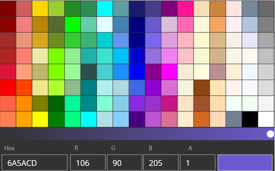
ColorPicker Control
A color picker is used to browse through and select colors. By default, it lets a user navigate through colors on a color spectrum, or specify a color in either Red-Green-Blue (RGB) or Hexadecimal textboxes.
| Property | Description |
|---|---|
| Default | Sets the default color for the Color Picker in Hex representation |
Output
| Property | Description |
|---|---|
| SelectedColor | Gets the selected Color value. |
| SelectedHexColor | Gets the selected Color value in Hex representation. |
Preloader Control
A progress control provides feedback to the user that a long-running operation is underway. It can mean that the user cannot interact with the app when the progress indicator is visible, and can also indicate how long the wait time might be, depending on the indicator used.
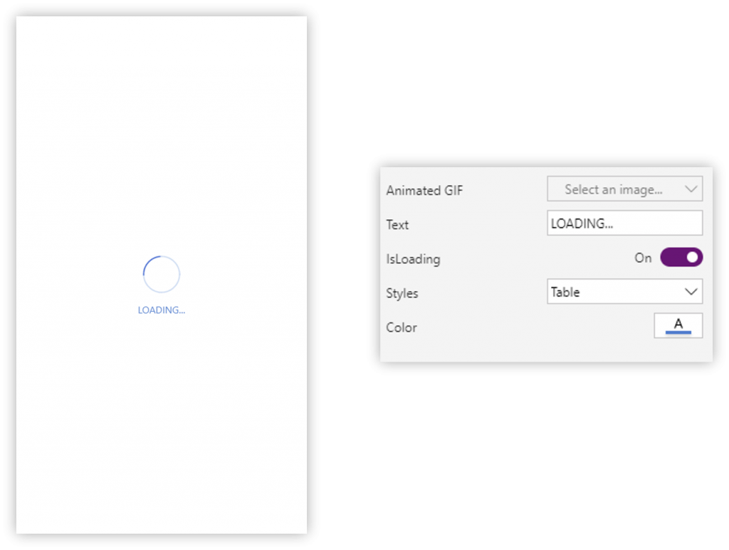
| Property | Description |
|---|---|
| Animated Gif | Sets the animated Gif for the Preloader animation. |
| Text | Sets the text for the preloader |
| Color | Sets the color of the preloader text. |
| Styles | Sets a collection of styles that controls various visual aspects of the Preloader. e.g:
Table({Key: "Font", Value:"Segoe UI"}) |
Give it a try ! We would love to hear your feedback. We have more open-source components coming soon to the PowerApps Tools github repository…. If you have any feedback or issues, please feel free to add to https://github.com/Microsoft/powerapps-tools/issues.
