March 2024 updates for modernization and theming in Power Apps


Note: This blog is in continuation of the series of modern controls coming to canvas apps. You can find the February 2024 updates here.
Modern controls updates in canvas apps
We continued enhancing modern controls and theming and delivered some key enhancements, which are rolling out to our customers at the time of publish. Below are the updates made to controls and theming in the last month:
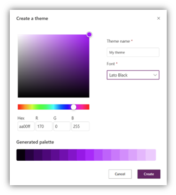
- Simple custom theming – We are excited to announce the availability of simple custom theming in canvas apps! This has been the most requested item in the theming space since the introduction of modern theming. With this feature, makers are no longer bound to one of the 8 out-of-box themes; instead, you can create your own theme by choosing a seed color for your theme and the font. The generated theme will then be applied automatically to all modern controls in your app, eliminating the need to manually modify the Color palette and Font properties on each control. We hope you enjoy this new capability, and we look forward to hearing your feedback!
- Stream control – We recently released new Stream control (based on SharePoint) in Power Apps in preview. The Stream control in Power Apps lets you embed Microsoft Stream (on SharePoint) videos directly in your canvas app. Adding a Stream video in your app makes a smooth integration of videos hosted on Microsoft Stream in your canvas app.

Upcoming enhancements to modern controls and theming:
We are currently working on a few exciting updates that will be released in next few weeks:
- New controls
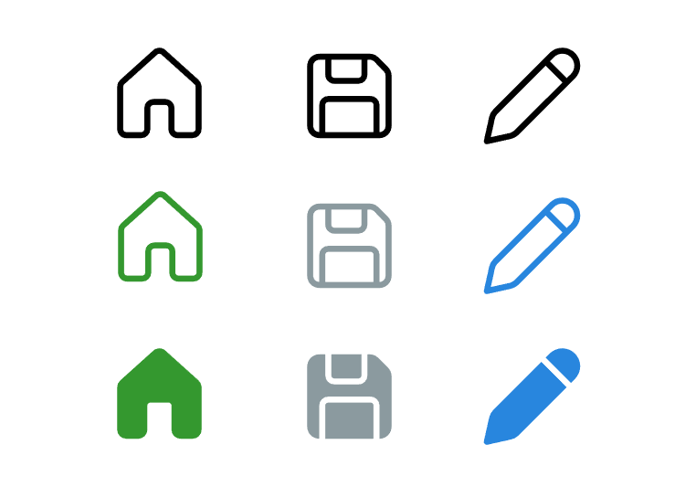
- Icon control – We are almost finishing work for new icons based on fluent design language and preparing to deploy them. These icons will also be available as an additional feature on button control.
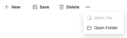
- Toolbar control – We also kicked off work on the toolbar control. The toolbar control is a horizontal bar that contains one or more commands that can be selected by the user. The commands can have text, icon, or both, and can have different appearance and behavior depending on the maker’s configuration.
- Icon control – We are almost finishing work for new icons based on fluent design language and preparing to deploy them. These icons will also be available as an additional feature on button control.
- Modern theming for classic controls – To date, modern theming has had no effect on classic controls. This meant makers were forced to manually update the styling of classic controls to align with the modern theme, ideally using theme variables, for apps that contain both classic and modern controls. We are working to address this issue by allowing classic controls to automatically utilize the app’s modern theme as best they can to minimize the maker customization efforts in this area.
- Upcoming styling on all modern controls:
- Fill – This property will be available to add or edit background color of all input controls, text control and more.
- Padding – Makers will soon be able to provide left, right, bottom and top padding to almost all modern controls.
- Border properties – We are making Border color, style, thickness and radius properties available to all applicable controls including input controls.
- Align – We are also adding align options for button, badge and number input control.


