Effortlessly find and switch between icons in canvas apps


There is an icon in almost every app or website. A plus icon, a search icon, there’s even refresh icons on your browser you’re reading this blog in right now. The icon control in PowerApps allows you to include these graphical symbols for which you can configure properties such as their color, or their OnSelect property so that the app responds if the user selects the icon.
We have heard lots of comments associated with searching the long list of icons that exists, in addition to the difficulties in switching between the type of icons that are showing. With this feature update, rolling out worldwide this week, we allow you to search the list of icons, as well as switch between which icon is displaying.
Icon property
“Icon” is a new property on the icon control. It enables you to choose which icon to display. It has a list of distinct types of icons that can be displayed. When typing in the formula bar, type “Icon” followed by a period in order to use the intellisense to view all of the options.

An example of a scenario is to change the type of icon to indicate status in a gallery, showing a happy face for a good rating and a sad face for a bad rating. This can now be done with a single icon and formula.
Icon
Icon = If(ThisItem.Rating <7,Icon.EmojiSad, Icon.EmojiSmile)
Color = If(ThisItem.Rating <7,Red, Green) 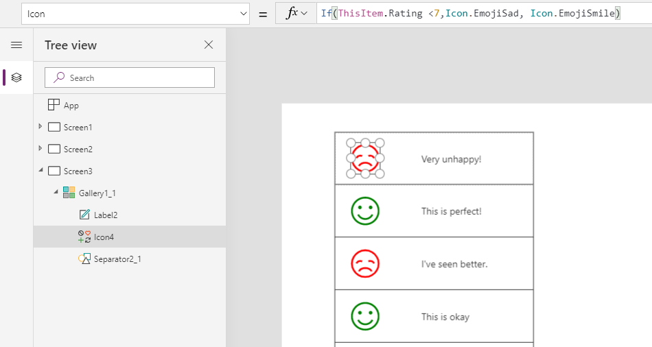
Not only does the icon property help with reducing the overall number of controls which helps app performance, as well as reduce the difficulty of working with show/hide logic, but the icon property can also help the flexibility of using icons when building components.
Rotation property
The new icon Rotation property allows you to rotate icons by a number of degrees. This can help extend current icons that are in the list to change their visual meaning (such as rotating download so it can act as an upload) , but it can also help accomplish different scenarios.
An example of a scenario is to set the rotation on a chevron to change what direction it’s pointing in order to create an expand and collapse menu. To accomplish the expand collapse behavior, I created a boolean variable to track when the icon has been selected, and based on that value, updated the Icon rotation property, and the Gallery visibility. I named the variable varChevron for demo purposes, but you could name it whatever you like.
Screen
OnVisible = Set(varChevron, true)
Icon
OnSelect = Set(varChevron, !varChevron)
Rotation = If (varChevron, 90, 0)
Icon = Icon.ChevronRight
Gallery
Visible = varChevron
For those of you who want to create loading icons or other rotations, a simple pattern is to reference a timer in the icon rotation property.
Icon
Icon = Icon.Clock
Rotation = Timer1.Value/10 
These improvements for the icon unlock a bunch of new capabilities. Let us know in the blog comments below what you think, or tag your PowerApps Community forum post with #AwesomeIcons with any feedback, or if you want to share how you are using the new icon capabilities.
Happy building!
Emma Cooper , Twitter: @PowerEmmz
