Craft App Height and Width expressions to create responsive canvas apps


If you’ve built canvas apps using PowerApps, you’ve noticed that one of the first decisions you need to make is whether you want a layout that is tailored for a phone or for a tablet. This choice will determine the size and shape of the canvas you will work with while building your app.
If your app is used on a device of a different size (or on the web), your entire layout is scaled larger (or smaller) to fit the screen where it is running. If an app designed for a phone is run in a large web browser window, for example, it appears almost comically oversized for its space. It can’t take advantage of all those additional pixels, by showing more controls or more content.
With this new update, experienced app makers can now transform apps into a responsive experience through some work with expressions. You must write formulas that adapt the size and position of controls based on the size of the screen at runtime which is now able to be referenced in the app. You’ll be able to adapt the layout of each of your screens to the actual space in which they are running. As a result, screens show more information with more appropriate font sizes, all making for a better app experience.
Turn off Scale to Fit
As responsiveness is not yet the default for canvas apps, you will need to disable the current default fixed size behavior.
Navigate to App settings > Screen size and orientation, then turn the Scale to Fit toggle to “Off”.
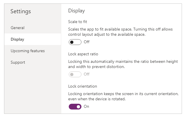
To learn more about these options, refer to the size and orientation settings in our documentation.
Writing expressions with App Width and Height
Now this announcement is to say that creating responsive apps is possible, unfortunately, not that it is easy. You can now use App.Width and App.Height which return the app’s current width and height. This means you can use expressions to accomplish position and sizing based off of their values.
For a simple example: let’s look at a rectangle that can make a header on an app. When the app grows or shrinks, we want the width of the rectangle to fill the screen, but the height to remain the same.
//Rectangle Header properties
Rectangle1.Width = Parent.Width
Rectangle1.Height = 88
We can see how the rectangle width is the same as the screen, which takes the full space of the app window.

Some best practices and examples on how to write expressions for different responsive behavior can be found in our documentation on creating responsive layout.
There are still quite a few known limitations that we will be working to lift in the coming while. Most notably:
- Moving the controls on the canvas in authoring mode will replace the custom expression to a constant value. It is recommended to select controls using the tree view.
- The responsive sizing cannot yet be seen in the authoring studio. In order to test this functionality, you must Save and Publish your app.
Feedback
This capability is one small step for PowerApps, one giant leap for the PowerApps community. We are still planning on more investments on providing an experience that allows canvas apps that are responsive by default. Let us know any feedback in the comments below or on the community with the hashtag #ResponsiveLayout
