Import components from cloud apps


Importing components from a local file is no longer the only way to share! With this update, you can share components using cloud apps. This feature is currently rolling out and it will become available this week. Here are the details.
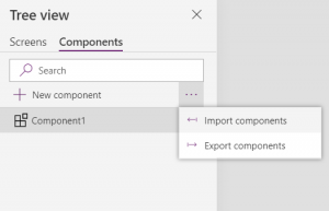
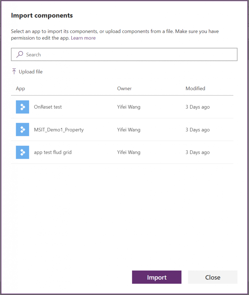
Clicking on Import components as shown below now opens a dialog instead of a local file explorer.
The dialog shows all apps that contain components and that you have permission to edit. Selecting an app and clicking the Import button will import the most recent published version of all of the components in that app into your app. Once they’re imported you can make edits to your copy or delete the ones you don’t need. You can also import components from as many apps as you want!
If you want to share components with others you must first, publish your app with components and second, add who you want to share with as co-owners of the app (see: share a canvas app).
Updating apps to be enabled for cloud sharing
For older apps, you will need to open the app that contains component masters, save and publish it again. This will tag the app appropriately so it shows up in the import dialog list.
More improvements on the way
We plan to unlock many new capabilities for components soon! What’s on the way includes: embedding data sources in components, reset property, component events, and more.
And we want to hear from you! Please leave any comments in this blog, or post in PowerApps forums with #component.
Try out progress indicator component samples
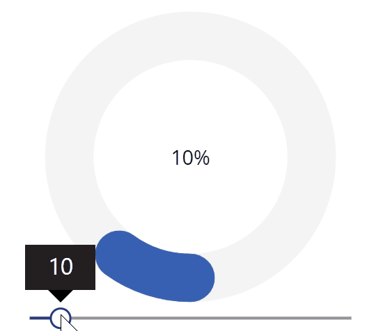
This component is a circular progress indicator. You can use it to display progress of any sort or use it to get user input. Download it here.
| Property | Description |
|---|---|
| Value | The number value of the progress bar. It can also be referenced as an output from the component. |
| Incomplete fill | Sets the fill color of the incomplete progress. It takes hex color code as input format. |
| Current fill | Sets the fill color of the complete progress. It takes hex color code as input format. |
| Completed fill | Sets the fill color of the bar when the progress is 100%. It takes hex color code as input format. |
| Stroke width | Takes a number input as the thickness of the bar. |
| Percentage toggle | Select format between 100% or 100/100. |
| Slider toggle | Show/hide the slider bar in the bottom. |
| Circle radius | The radius changes how big or small is the circle bar. |
| Maximum value | Maximum number of the progress. |
| Rounded | Select between round or sharp cut of the current progress. |
| Minimum value | Sets the minimum number of the slider bar. It is useful when asking user input with a floor value. |
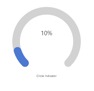
The second component is a partial circle version of the progress indicate with the same functionalities and similar properties. Download it here.
If you are interested to learn how to compose this component, check out this article by David Nissimoff.
